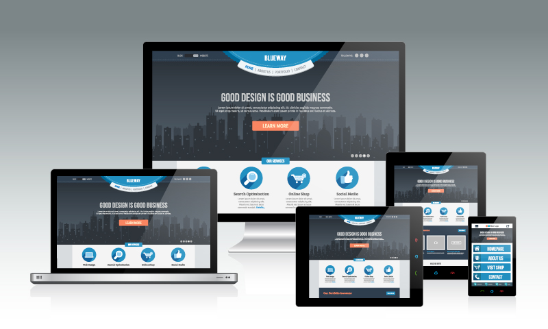
If you are a savvy business then you cannot ignore getting your website designed and developed in such a way that it is compatible to most of the popular mobile phones. If you ignore mobile phones then you are losing on a large market share.
Designing a website for browser is different from designing it for the mobile phones because the browsers on your PC are different from the browsers on your mobile phones and mobile phones have constraints regarding the speed, memory, processing power, broadband speed, screen size, etc.
Therefore it is essential to Web design your website accordingly so that businesses can achieve maximum returns and can reach to every user.
General rules of website design for mobile phones
- Keep it simple: keep the web design as simple as possible;
- Minimum or even no use of flash as flash is mostly not supported by phone browsers
- Minimum or even no use of Javascript in the HTML page due to its dependence on the client side browsers
- Low res images or possibly a separate and simplified version of your website which has no images
- Web design should have navigation on the top most part of the website so that it is easily viewable in the small phone screen
- Navigational dropdowns can be challenging; most of the phone browsers do support it but testing on different browsers will meet this requirement
- Images should have value in the ALT tag with the suffix Img or Image so that if images are not supported then the viewer can come to know what image is that
- Large Banners: If you have large banner image then you should display it with the help of CSS and write a separate CSS for mobile phone and hide the images from their
- Validate your pages and CSS files from the W3C validator
- Finally test it on different phones such as Haiphong, Nokia, Andriod, etc
Does your existing website works on mobile phones? Let us know if you would like your website reach the wide audience.


